Dashboard overview
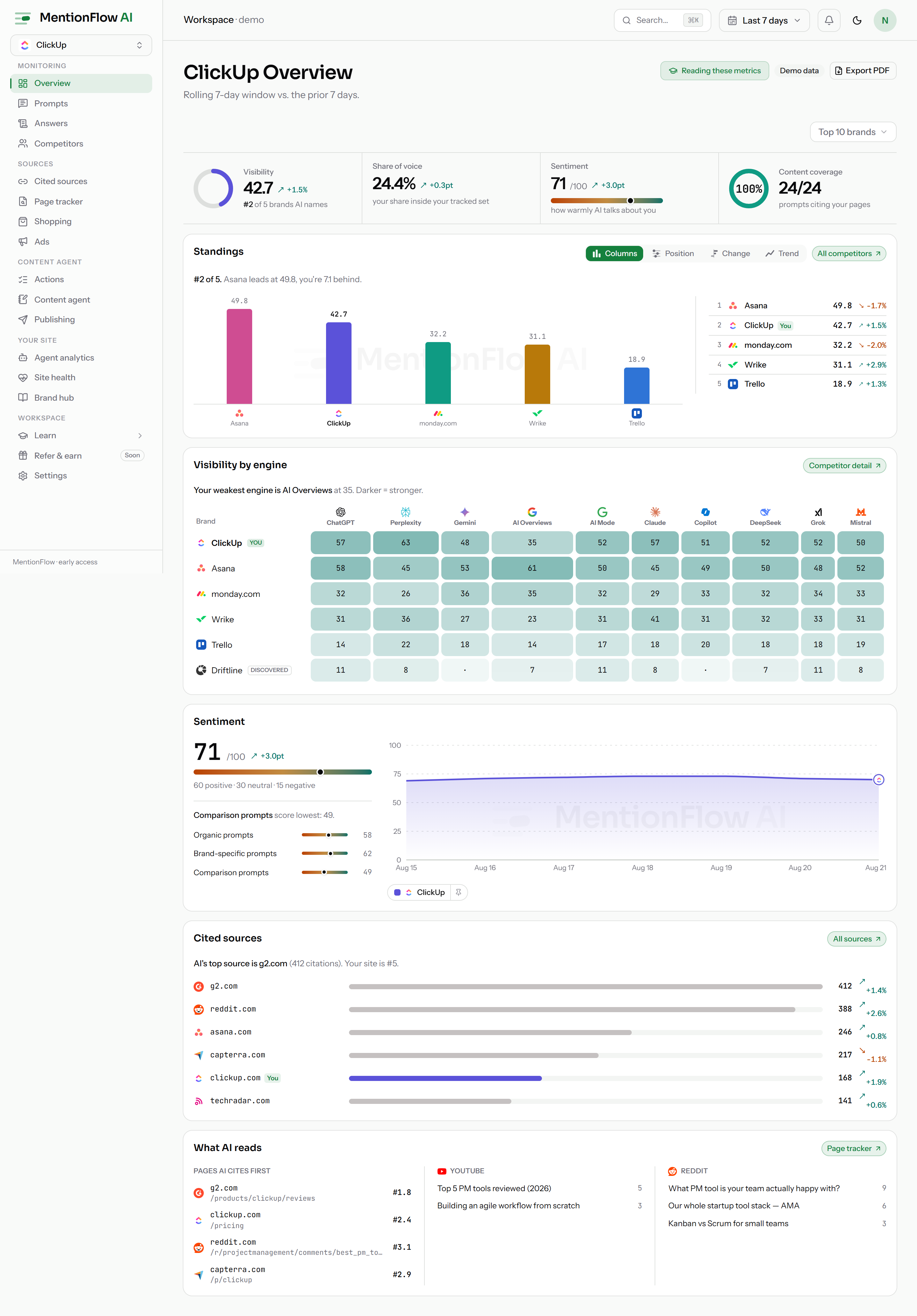
The dashboard home. Five metric cards, the you-vs-competitors chart with its ranking rail and full competitor matrix, an average-position bump chart, collection health, and top movers, all from one rolling window.
Overview is the one screen to check each morning. How visible am I in AI answers? Am I gaining or losing ground? Is the tone positive? Is anything moving? Five headline cards answer that, over a trend, a ranking rail, and a day-by-day rank chart. Every card is a doorway to the detail behind its number.
What it does
Overview pulls one window of collected runs into a set of panels:
- Five headline metric cards: Visibility, Citation Share, Share of Voice, Sentiment, and Estimated impressions, in that order. Each shows its value, a delta against the prior window, a line saying what qualifies that value, and a small trend. They are peers. No card leads, and none is bigger. See Reading the five metric cards.
- "You vs. competitors": a trend chart with three views (Visibility, Share of voice, Sentiment) and a prior-window overlay. Your line is emphasized, competitors dimmed. A ranking rail beside it follows whichever metric the chart shows.
- The competitor matrix: every tracked brand against all four comparable metrics, each with its delta. The rail's Details button opens it.
- Average position: a bump chart ranking you and up to nine competitors day by day, with brand-logo nodes, beside a leaderboard of window averages.
- An engine split: where your presence comes from.
- Collection health: the "Collection" strip. Then top movers, top cited sources, content coverage, your most-cited pages, and top ranked URLs.
Every panel is computed from the same window, so the cards and the charts always agree.
Reading the five metric cards
Each card has the same four rungs, top to bottom:
| Rung | What it carries |
|---|---|
| Eyebrow + ⓘ | The metric's name, and an info tip with its full definition. |
| Readout | The value at 24px in tabular figures, with the delta chip beside it and "vs prev N d" naming the comparison window. |
| Honesty line | What qualifies the number: the band word, the denominator, the model basis, or the reason there is no verdict. |
| Trend | A muted sparkline of the metric's last eight days, pinned to the card's bottom edge so all five sit on one line. |
The cards are not decorated equally. Every difference is a ruling, not styling:
- A colour is a verdict, so it has to be earned. Only Visibility, Citation Share, and Share of Voice have a published cutoff. Only those three paint their numeral and top hairline in a red to amber to green score token. Each metric's page states its own cutoff: Visibility, Citation share, Share of Voice. A card with no verdict gets no hairline and a plain numeral.
- The honesty line says one of three things. The metric earned a band: the Visibility word Low / Building / Strong, or the par vocabulary for the two share metrics, painted in the numeral's token with its basis one hover away. Or it states a fact that is not a verdict, like Sentiment's "50 = neutral". Or it says there is no scale, with the reason on hover. Share of Voice below two tracked brands reads "no par", because par would be 100%. Est. impressions always reads "no scale". An unbounded modeled count has no denominator, so no proportion and no verdict colour.
- A denominator never hides in a tooltip. Share of Voice names the set it divides by on the card face: "among you + 4 tracked competitors · untracked brands aren't counted". With nobody else in the set, it says you are the only brand there. Est. impressions says it is modeled. These lines may wrap on a narrow card, but they never move to hover-only.
- An absent value is an em-dash, and it drops what it can no longer support. A card reading "—" gets no colour, no band word or neutral fact, and no delta chip. The delta slot shows its own em-dash. "no scale" and "no par" describe the metric, not the missing value, so they stay. The unlock reason takes the face line. An unmeasured Est. impressions reads "needs prompt volumes · no scale".
- Deltas keep their producer's units. Share of Voice, Citation Share, and Sentiment move in points. Visibility moves in relative %. The "vs prev N d" label rides only a real delta, never a "new" badge.
- Est. impressions carries no delta and no sparkline on live data. There is no daily impressions series and no prior-window figure to compare, so both slots read an em-dash. The demo workspace authors both, so the demo row shows five uniform cards.
- The row reflows, it does not re-rank. Two cards across on a phone, the odd fifth going full-width. Three from 768px. All five in one row from 1280px. The order never changes.
How to use it
- Set the window. The top-bar date picker sets the rolling window, or a custom span, for the whole dashboard. The compare-to-previous toggle beside it draws the dashed prior-window overlay. One control serves every data page. See Date ranges and the top-bar picker.
- Filter by engine. The All engines dropdown is a checkbox multi-select. Tick one engine or several to compare models. Every panel narrows to the ticked set, shareable as
?engine=chatgpt,perplexity. Only engines with collected data are listed. Ticking every engine, or none, clears the filter back to the blended view. - Check collection health. The Collection strip shows the project's sampling config: market, engines, assigned prompts, status, last run. Its Collection settings link opens Collection. A project has exactly one config, and that one config carries up to five markets, so several markets need no second project. Workspaces still holding more than one config from the earlier multi-monitor model get a Monitor chip beside the engine filter. It scopes every panel to one config: same formulas, narrower window, shareable as
?monitor=…. - Toggle "Category prompts only." This drops prompts that name you or a named rival. What is left is how you show up when nobody put your name in the question.
- Switch what the chart tracks. "You vs. competitors" has three views: Visibility, Share of voice, Sentiment. The ranking rail follows the same choice, so chart and list always show one metric over the same entities. Average position has its own card below, because rank over time reads better as a bump chart.
- Spotlight one brand. Your line leads. Competitors rest dimmed at half ink. Hovering a line or a legend chip raises that brand and dims the rest. It dims, never hides, so it can't be misread as a filter. Click a line, or the pin button on its legend chip, to keep a brand spotlighted after the pointer leaves. Click again to release. A live hover always wins over the pin.
- Use the legend as two controls. Each chip is a split capsule. The left segment hides the series, and at least one series always stays visible. The right segment is a pin button, the keyboard path to the spotlight you get on click. The legend lists you plus the top four competitors on the active metric, with an "Others (N)" toggle for the rest. Folding it hides chips, never data. Folded brands keep drawing, dimmed.
- Expand to the full matrix. The rail's Details button replaces it with "You vs. tracked competitors". Every tracked brand is a row. Visibility, share of voice, sentiment and average position are the columns, each with its delta. Click a column head to re-rank by it. The table opens ranked by whatever the rail was showing. Ranking collapses it back.
- Read the average-position bump chart. Lanes are ranks, nodes are brand favicons. A day where no answer named a brand shows no node and breaks that lane. Ranks are never guessed. It holds you plus up to nine competitors, your own project always included. Hovering a lane, a node, or a leaderboard row spotlights that brand across both. Clicking pins it. Below 768px the chart is hidden and the leaderboard carries the card on its own.
- Spot "read but not named." On the Visibility view, from day two a dashed "your site cited" line is overlaid in your own colour. The solid line is how prominently answers name you. The dashed line is how often they cite your site. Dashed above solid means assistants are reading your site without saying your name. That is a direct signal for your content and PR work.
- Read the prompt-change markers. Any day you added prompts carries a dashed marker on the trend card. A visibility step that came from a bigger prompt set never reads as organic movement. Only additions are marked. See Prompt-change markers.
- Read the first-run banner. On day one, a cadence-honest banner explains that the window is still filling, so you don't misread a partial window as a low score.
- Follow a card. Every card and list deep-links to its full page: Prompts, Competitors, Sources.
- Generate a report. The "Generate report" button opens the Briefing at
/reports/briefing. It writes this window out as sentences built from the measured values, with a list of the claims the numbers could not support.
How it's computed
The base scope is the search-grounded engines only, blended, unless you apply an engine filter. Then the panels follow exactly the ticked set. Every card's delta compares the current window against a prior window offset by the same number of days.
The engine filter is a set, spelled in the URL as a comma list: ?engine=chatgpt,perplexity. Repeated keys mean the same set, so ?engine=chatgpt&engine=perplexity equals the comma form. Duplicates and click order are normalised, so one selection is always one link, and an unknown id is dropped rather than shown as an error. Ticking every engine, or none, normalises to no filter, since "All engines" already means the blended scope. An explicit subset bypasses blending, so picking a knowledge-only engine (DeepSeek) is the only way to fold it into the math. The same grammar drives every filtered surface (Overview, Competitors, Answers, Sources, Fan-outs) and the CSV export routes. One link never means two different run sets on two screens.
- Visibility is scored
0–100and shown to one decimal. - Share of Voice uses per-entity run-presence counts, the runs that mention an entity at least once, over the total of your brand plus the competitors you track. Brands your answers name that you don't track are not in that total. So it is a within-set share, not a share of the market (what it excludes). Its delta is a point difference (percentage points), not a percent change, because it is a share.
- Citation Share and Sentiment show an em-dash when null. There is nothing to average yet.
- Estimated impressions = the sum, across prompts that carry demand data, of
presence rate × the prompt's estimated volume band. The input is a band, so the card shows a range (8.5K–14K) rather than a false-precision integer. Its ends are rounded outward, low floored and high ceiled, so display can widen the modeled band but never narrow it. When both ends round to the same figure the range collapses to that single figure (12K). Demand that isn't measured is an em-dash, never a made-up count. - Content coverage = covered prompts divided by prompts with at least three runs. Null renders as an em-dash.
- Top movers are the top five prompts by absolute visibility change in the window.
The comparison panels re-shape numbers the provider already computed for this window and scope. Switching the chart's metric, sorting the matrix, or expanding Details never refetches and never re-filters:
- Ranking is best-first, and unmeasured is not worst. Rows with a value sort by it, and lower is better for average position. Rows with no value fall to the bottom in stable order, but they are not given a rank. Their rank cell reads
·, because an unmeasured brand is unknown, not last place. - A "—" in the matrix is not a zero. Every unmeasured cell renders an em-dash titled "Not measured in this window and scope", and the table says so under itself: "— is not measured in this window, never a zero."
- Bars are drawn only where length in proportion to value is honest. Visibility and Share of Voice get bars on an absolute 0 to 100 track. 40 fills 40%, never rescaled to the leader. Sentiment gets none, because 50 is neutral by construction and its zero point is not an origin. Average position gets none either, because there is no "more is more" reading of a rank. A bar's hue is the brand's own series colour, never a verdict ramp.
- Sparklines are shaped, not scaled. Each card's trend is drawn against its own eight-day min and max, so it reads as a shape rather than a level. A null day breaks the line instead of bridging or zero-filling it.
A few window and honesty rules shape what you see:
- Daily series drop null days rather than zero-filling them, so a gap never draws a false dip. The trend chart breaks its stroke on uncollected days, and the bump chart leaves that column with no node.
- The trend chart and the bump chart both need two days before they draw. Until then they say so and point you at the tables.
- A metric built from fewer than five runs carries a low-confidence flag.
- The Collection strip flags a config stale after 36 hours without a run.
The engine-split "clicks" figure stays null until the tracking snippet fires its first-ever event. A 0 there would falsely claim tracking is live when it simply hasn't reported yet. See How MentionFlow handles missing data.
Limits
- There is no page-level plan gate on Overview.
- The dashboard loads a rolling span of about 56 days by default. A longer preset (90 or 180 days) or a custom range widens how far back it reads, up to a 200-day custom range. Opening an individual answer receipt older than about 56 days may no longer resolve. The metrics still count it, but the original answer page can expire.
- The competitor matrix ranks by one column at a time. Its sort lives on the page rather than in the URL, so it is not a shareable link.
- The average-position chart holds at most ten brands, your project plus up to nine competitors. It is not rendered below 768px. The leaderboard beside it carries every width.
- Your remaining prompt quota is shown by the quota meter in the sidebar.
Related
- Prompts: the tracked-prompt portfolio behind the movers.
- Competitors: the full share-of-voice leaderboard behind the matrix.
- Sources: the domains behind top sources.
- Workspace and members: the Settings surface holding the collection config behind the health strip.
- Reports: the briefing the "Generate report" button opens.
- Overview metrics: the definitions behind each card.
- Data honesty: why null values render as em-dashes.
- API / MCP:
GET /api/v1/overviewand theget_overviewMCP tool. See the Resource reference and MCP server.